
How to Judge Rug Colours Online: Photos, Lighting and Screen Differences
A rug's colour in a photograph is a representation of its appearance under particular lighting and camera conditions. It is not a guarantee that the rug will look identical in every room or on every screen.
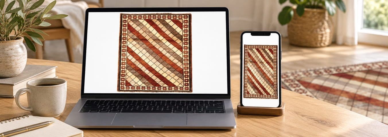
A rug's colour in a photograph is a representation of its appearance under particular lighting and camera conditions. It is not a guarantee that the rug will look identical in every room or on every screen. To judge colour more confidently, compare several views of the same rug, check its colour in natural and artificial light where possible, inspect close-up photographs, and ask the seller for additional images or a video if an important shade remains uncertain.
1. Why do rug colours look different online?
A colour is not perceived in isolation. What you see depends on the light illuminating the rug, the way the rug reflects that light, the surrounding environment and the characteristics of the screen displaying the photograph.
For online rug shopping, it helps to distinguish between four different things:
1. The physical rug
The actual dyed fibres, wool or silk, pile direction, weave, surface texture and natural variations within the rug.
2. The photograph
The camera, exposure, white balance, lighting, editing, image compression and colour profile used to create the product image.
3. The display
Your phone, laptop, tablet or monitor, including its brightness, colour mode, display technology and calibration.
4. Your room
The direction and intensity of daylight, the type of lamps, wall and floor colours, furniture, shadows and the time of day.
The final appearance results from the interaction of these factors. A photograph may accurately represent the rug under its shooting conditions and still look different from the same rug in your living room.
That is why a responsible online buying decision should not depend on one photograph alone.
2. How lighting changes the appearance of a rug
Lighting has two important characteristics:
- Intensity: how much light reaches the rug.
- Colour temperature and spectral composition: the character of the light, which influences how colours are perceived and recorded.
Colour temperature is commonly expressed in kelvin (K). It is a useful guide to whether light appears warmer or cooler, although the kelvin value alone does not fully describe a light source's ability to reveal colours.
2.1 Daylight: why a rug may look brighter near a window
Daylight changes throughout the day and with weather, window orientation, season and the amount of direct sunlight.
In a European home, a rug beside a large south-facing window may receive quite different illumination from a rug in a north-facing room or a shaded corner.
Direct sunlight
Strong sunlight can create bright highlights, pronounced shadows and a greater difference between illuminated and shaded parts of a rug. Some colours may appear more vivid, while pale areas can look washed out in an overexposed photograph.
Indirect daylight
Light reflected from the sky or surrounding surfaces can provide softer illumination and reduce harsh shadows. This is often a useful condition for examining the overall colour balance of a rug.
Overcast daylight
Cloud cover often softens the light. Depending on the sky and surroundings, the resulting illumination may also be cooler than warm indoor lighting.
Practical advice: If you are checking a rug in person, examine it in a bright room without relying exclusively on a patch of direct sunlight. If possible, look at it near a window and then a little farther into the room.
For an online listing, look for photographs that show the rug under reasonably neutral, even lighting, ideally with enough detail to see both the overall palette and the individual fibres.
2.2 Warm artificial light: why reds, creams and browns can look different
Many homes use warm-white lamps in living rooms and bedrooms because they create a cosy atmosphere.
Warm lighting can change the appearance of a rug's palette. Cream and ivory areas may seem more yellow or golden. Some reds, oranges and browns may appear warmer, while blue and grey details may look less distinct or take on a different visual balance.
This does not necessarily mean the rug itself has changed colour. The light reaching your eyes has changed, and the visual relationship between the rug's colours has changed with it.
2.3 Cool artificial light: why blues and greys may appear different
Cooler-looking lamps can make a room feel visually different from one illuminated by warm lamps.
Depending on the lamp's spectral output and the surrounding surfaces:
- Blue and blue-grey details may appear more prominent.
- Cream and beige areas may appear less golden.
- Some reds and earthy colours may appear less warm.
- Grey shades may look different from how they appear under daylight.
However, it is important not to assume that every cool-white lamp produces the same effect. Two lamps with similar colour-temperature ratings can still render the same rug differently.
2.4 Mixed lighting: a common source of confusion
A living room may have daylight entering through a window while warm ceiling lights or table lamps are switched on.
This creates mixed illumination. Different parts of the rug may receive light with different characteristics, making the colour balance less uniform.
For example, one side of a rug may look relatively cool near a window, while another side appears warmer beneath a lamp.
Buying tip: When judging colour, compare views taken under consistent lighting conditions. Avoid drawing conclusions from a photograph that combines strong daylight, artificial light and deep shadows unless that mixed lighting reflects the environment in which you intend to use the rug.
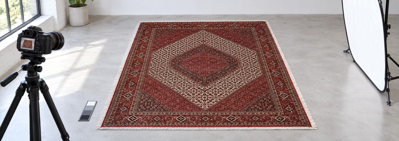
3. Why handmade rugs can change appearance when viewed from different angles
Lighting is only part of the explanation. Handmade rugs also have a physical structure that influences how they reflect light.
3.1 Pile direction and the light-and-dark effect
Many hand-knotted rugs have a pile that lies predominantly in one direction. When light strikes the pile, the fibres reflect and scatter it differently depending on the viewing angle.
As a result, the same section of a rug may appear:
- Lighter when viewed from one direction.
- Darker or deeper in tone when viewed from the opposite direction.
- Slightly different in contrast when viewed from the side rather than from above.
This effect is particularly noticeable in rugs with a wool pile. It can make one part of a rug appear darker even though the underlying yarn colours are the same.
In the rug trade, this directional appearance is often discussed as the pile-direction effect or, in some contexts, shading.
It is important to distinguish ordinary pile-direction shading from a genuine defect, uneven dyeing or a colour change caused by damage. A photograph alone may not be sufficient to establish which explanation applies.
3.2 Natural wool and the character of the fibres
Wool is not a perfectly uniform synthetic surface. Differences in fibre characteristics, yarn preparation, pile height and the way the fibres lie can affect the way light is reflected.
In a handmade rug, this can contribute to a subtle variation in the appearance of a colour across the surface.
Two areas described as beige, for example, might not appear equally bright when viewed from different angles. This does not automatically indicate that two different dye colours were used.
3.3 Why a close-up can look different from the full rug
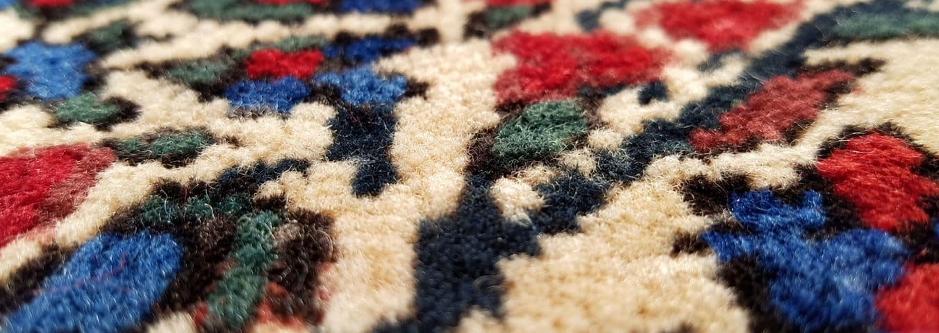
A close-up photograph reveals the structure of the yarn, individual knots and small variations in the pile.
At this scale, a colour can appear more complex than it does from a normal viewing distance. A red field, for example, may contain several closely related red tones, along with small highlights and shadows from the fibres.
A full-rug photograph shows how those colours work together as a pattern. A macro photograph shows the material characteristics that contribute to the overall effect.
Both views are useful, but they answer different questions.
What to look for in a rug photograph
Full-rug view
Overall palette, pattern, colour balance and the relationship between the main colours.
Close-up view
Fibre texture, small colour variations, knot structure, highlights and shadows.
4. How cameras and image processing affect rug colours
A product photograph is not simply a window through which you see the physical rug. It is a digital image created by a camera and processed for display.
Understanding a few basic photography concepts can help you interpret product images more carefully.
4.1 White balance
White balance is the camera's attempt to interpret the colour of the illumination so that neutral objects appear appropriately neutral.
If a photograph is taken under warm indoor lighting and the white balance is not adjusted appropriately, a pale cream area may appear excessively yellow or orange.
If the white balance is adjusted too far in the opposite direction, the same area may appear unusually cool.
White balance can be adjusted during photography or later in image processing. However, correcting a photograph does not guarantee perfect reproduction of every colour in the rug.
4.2 Exposure and contrast
Exposure determines how bright the image is recorded.
An overexposed photograph can lose detail in pale areas. An underexposed photograph can make dark colours difficult to distinguish.
Contrast adjustments can also change the visual relationship between colours. Increasing contrast may make a rug appear more dramatic, but it can reduce the visibility of subtle differences between similar shades.
For example:
- Ivory may lose detail and appear almost white.
- Dark navy may become difficult to distinguish from black.
- Burgundy may appear much darker than it does in a softly lit room.
- Subtle beige and taupe variations may become less visible.
4.3 Saturation and editing
Saturation describes the intensity of colour. Increasing it can make a rug look more vivid; reducing it can make the colours appear more muted.
For a buyer, the key question is whether the photograph represents the physical product faithfully.
A highly stylised lifestyle image may be useful for showing how a rug fits into an interior, but it is not necessarily the most reliable image for evaluating its exact colour.
Look for product photographs that show the rug clearly, without excessive filters or dramatic colour grading.
4.4 Colour profiles and image compression
Digital images use colour information that must be interpreted by software and displays. Differences in colour profiles, browser handling, image processing and compression can contribute to variations in the displayed result.
The sRGB colour space is widely used for web images. Preparing product images consistently for web display can help reduce some avoidable differences, but it cannot make every screen reproduce the same colour.
A well-managed image workflow is therefore a way to improve consistency, not a promise of absolute colour identity.
5. Why your phone, laptop and monitor may show different colours
Even when two devices display the same image file, the perceived colour may differ.
Some of the reasons include:
Display factor
What it can mean for a rug buyer
Brightness
A very bright display may make pale colours look lighter and can obscure how a rug will look in a normally lit room.
Colour temperature
A warmer or cooler display setting can change the apparent balance of creams, blues, reds and greys.
Display technology
Different screens can reproduce colour, contrast and dark tones differently.
Viewing angle
Some displays change in brightness or colour appearance when viewed from the side.
HDR and vivid modes
Certain display modes can make images look more intense or alter contrast compared with a standard viewing mode.
Night mode or blue-light filtering
These settings can deliberately warm the display and affect colour judgement.
Ambient light
Reflections, glare and the lighting around the screen can change how the image is perceived.
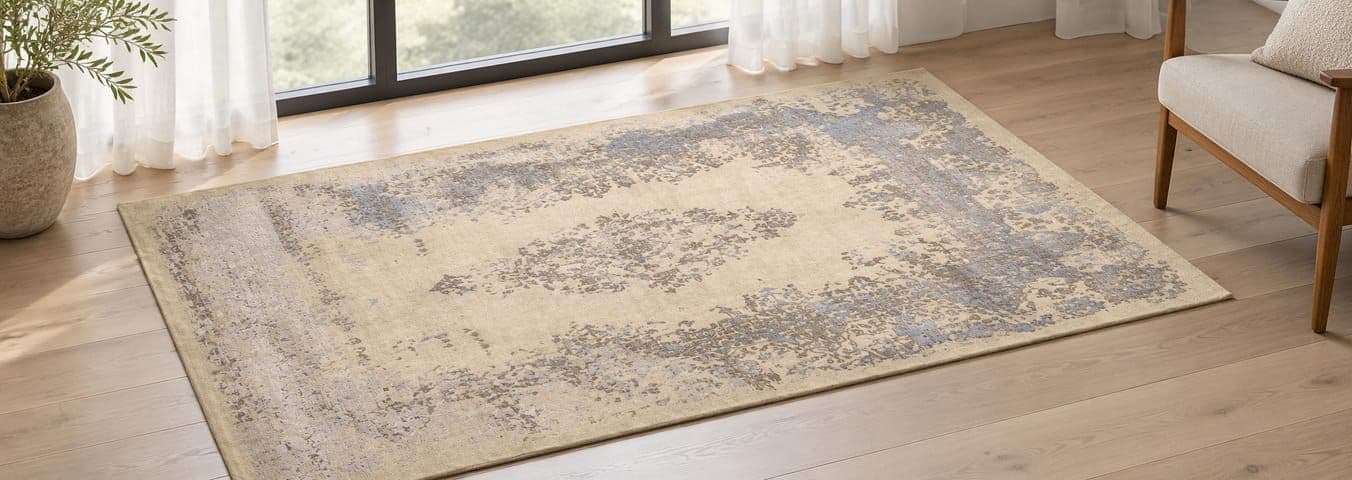
5.1 A practical screen-checking routine
If colour is especially important to your decision, use this simple routine before ordering.
Five-minute screen check
Turn off Night Shift, Night Light or other blue-light filtering modes temporarily.
Use a normal or standard display colour mode rather than an unusually vivid setting.
Set brightness to a comfortable level that is not excessively high.
Avoid judging the image with strong reflections or direct sunlight falling on the screen.
Open the same product image on a second device, if available, and compare the overall colour balance.
0 of 5 checks completed
Reset
These steps can make comparisons more consistent, but they do not calibrate your display to a professional reference standard. Even a calibrated screen cannot reproduce the physical texture, pile direction and changing illumination of a real rug.
Important: Do not change your screen settings repeatedly until the rug looks like the colour you expect. That can create a misleading impression. The goal is to view the photograph under reasonably normal conditions, not to manipulate the display to produce a preferred result.
6. How to judge a rug's colour using product photographs
When shopping online, the most useful approach is to assess several different types of image together.
1. Start with the full-rug photograph
Check the dominant colour, the secondary colours and the overall balance of the pattern.
Ask yourself: Is the rug predominantly red, blue, beige, green, ivory or a combination? Does one colour occupy most of the surface, or is the design visually balanced between several colours?
2. Examine the detailed photographs
Look at the field, border, central medallion and any areas with a high concentration of contrasting colours.
Check whether a colour described as ivory is actually cream, whether a dark blue is distinguishable from black, and whether the red contains warmer or cooler undertones.
3. Inspect the edges and fringe
These views may help you understand the material and construction, but remember that fringe and foundation colours are not necessarily representative of the pile colour.
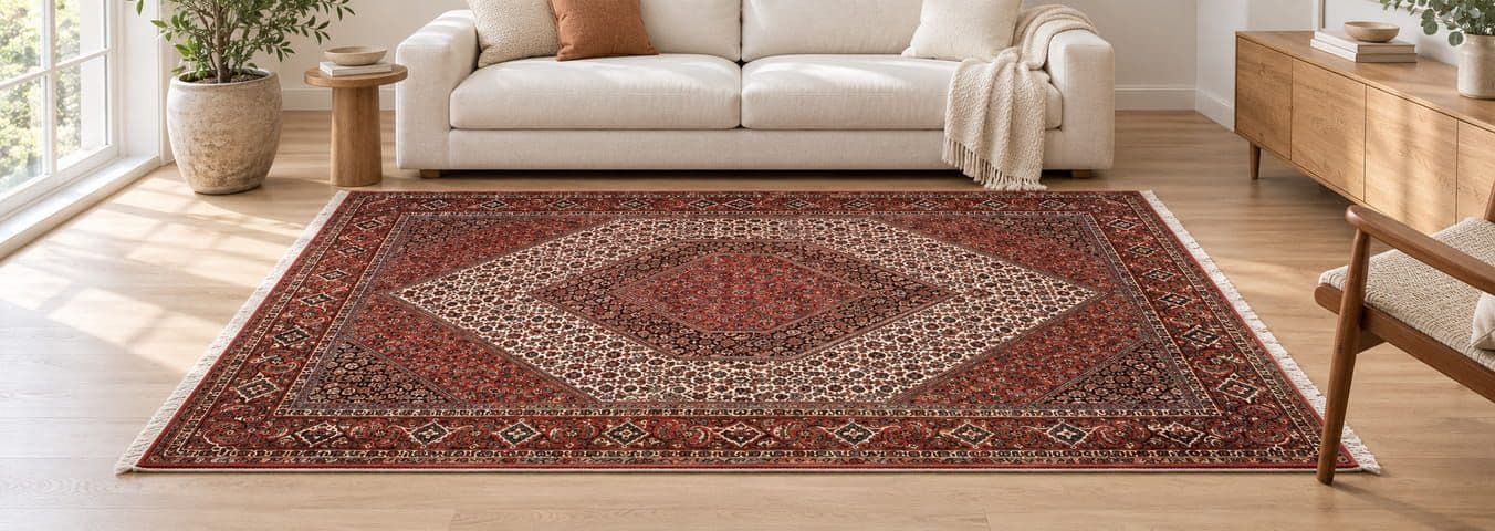
4. Look for additional lighting views
If the retailer provides multiple photographs, check whether the rug is shown in different lighting conditions.
These images can reveal how the surface responds to light, although differences in camera exposure and processing can also contribute to the changes.
5. Use a video as supporting evidence
A video can help you understand the pile, texture, movement and directional shading. It is particularly useful when the camera moves around the rug.
However, video is not automatically more colour-accurate than photography. Automatic exposure, white balance, compression and your screen can still affect the result.
6.1 Look for consistency between images
A useful question is not simply whether every photograph looks identical. It is whether the images tell a coherent story about the rug.
For example, if the product description identifies a rug as having a navy field with ivory and rust details, the photographs should allow you to recognise those colours and understand their relative prominence.
Some variation between images may be expected because of lighting and camera conditions. But if one photograph suggests a predominantly blue rug and another appears strongly green, with no explanation of the lighting or viewing angle, it is reasonable to ask the retailer for clarification.
6.2 Do not judge colour from lifestyle photography alone
Lifestyle images help you imagine how a rug might look with furniture, flooring and interior decoration.
However, they can also introduce additional colour influences:
- Warm wooden flooring can make nearby colours appear warmer.
- A beige sofa can change the visual impression of an ivory or cream rug.
- Coloured walls may reflect light onto the rug.
- Decorative lighting can make a room look warmer or cooler.
- Image editing may be used to create a particular interior mood.
Use lifestyle images to assess style, scale and interior compatibility. Use clear product photographs and detailed views to assess the rug's colour and construction.
7. How to match a rug's colour to your European home
A rug does not need to match every colour in a room exactly. It should work with the room's overall palette, lighting and materials.
European interiors vary considerably, from Scandinavian-inspired spaces with pale timber and restrained colours to traditional homes with darker wooden floors, patterned furniture and warm lighting.
The following examples are starting points, not strict design rules.
Pale wood, white walls and neutral furniture
Ivory, cream, sand, muted blue and soft terracotta may complement a light interior. Check whether the rug's pale areas look too yellow or too grey under your actual lighting.
Dark wood and traditional furniture
Burgundy, deep red, navy, warm beige and other rich colours may work with darker materials. Pay attention to whether the rug's darkest areas remain visually distinct from the floor.
Grey sofas and contemporary interiors
Blue, muted green, ivory and carefully chosen warm accents can create contrast. Check whether the rug's grey or blue tones change noticeably between daylight and evening lighting.
Warm neutral and earthy interiors
Rust, terracotta, brown, muted red and cream can complement warm materials. Make sure warm lighting does not make the rug appear substantially more orange or yellow than you want.
7.1 Compare the rug with your own room, not just an inspiration photograph
If possible, take a photograph of your room during the day and another in the evening.
Use these as references when considering the rug's dominant colours. You can also hold a sample of your flooring or upholstery beside the screen, but remember that comparing a physical object with a digital photograph is inherently imperfect.
A photograph of your room is useful for discussing style and colour relationships with a retailer. It cannot provide a scientifically reliable colour match unless the image capture and viewing conditions are controlled.
7.2 Consider the room's lighting direction
Think about where the rug will be placed.
- Will it receive direct sunlight for part of the day?
- Is the room mainly illuminated by artificial light?
- Are the lamps warm-white, neutral-white or cool-white?
- Does the rug sit beside a window, beneath a coffee table or in a shaded area?
- Will the pile direction run towards the entrance, away from it or across the main viewing direction?
These details can help explain why a rug might look different once it is installed.
8. Colour names: what do retailers mean by beige, ivory, cream and greige?
Colour names are useful descriptions, but they are not precise universal measurements.
Two retailers may use the same name for slightly different shades. A colour name may also describe the dominant impression of a rug rather than every colour within its pattern.
Colour term
Common meaning in rug descriptions
What to check
Ivory
A pale, soft off-white
Is it neutral, creamy, yellowish or slightly grey?
Cream
A warm off-white
Does it appear golden under warm indoor lighting?
Beige
A light neutral between pale brown and off-white
Is it warm beige, pink-beige, grey-beige or sandy?
Greige
A blend or visual balance of grey and beige
Does it look more grey or more beige in your room?
Taupe
A muted neutral, often combining brown and grey characteristics
Does it have a pink, purple, grey or brown undertone?
Burgundy
A deep red, often with a wine-like appearance
Is it closer to dark red, purple-red or brown-red?
Navy
A deep blue
Can you distinguish it from black in the darker parts of the rug?
Sage green
A muted, often greyish green
Does it appear more olive, grey or blue-green?
Rust
An earthy orange-red or reddish brown
Does the rug lean more orange, red or brown?
These are common descriptive conventions, not standardised colour coordinates. Actual shades and commercial naming practices vary.
8.1 Ask about the dominant colour and the secondary colours
Instead of asking only, "Is this rug beige?", consider asking:
- What is the dominant colour of the field?
- What are the main colours in the border?
- Are the pale areas closer to ivory or cream?
- Is the blue closer to navy, petrol blue or a lighter muted blue?
- Does the rug have a noticeable warm or cool overall appearance?
- Are the colours uniform, or are there visible variations across the pile?
These questions encourage a more useful description than a single broad colour label.
8.2 Natural dyes and colour descriptions
Some handmade rugs are made with natural dyes, some with synthetic dyes, and some with a combination of dye types. The appearance of a rug cannot reliably establish which dye system was used.
If the dye type matters to you, ask the seller for specific information about the rug rather than assuming that a particular shade or variation proves the use of natural dyes.
Likewise, terms such as antique, vegetable-dyed, abrash or sun-faded should be supported by an accurate description of the actual rug.
9. Colour variation, abrash and signs that deserve clarification
Handmade rugs can show variation in colour for several reasons. Understanding the difference between normal visual characteristics and issues that require further inspection is useful when buying online.
Abrash
Abrash refers to visible tonal variation within a rug, often appearing as bands or shifts in shade. It can arise from differences in yarn or dye batches and is a recognised characteristic in many handmade rugs.
Whether it is desirable depends on the individual rug and the buyer's preference. It should not be assumed to be present in every handmade rug.
Pile-direction shading
A light-and-dark effect caused by the direction of the pile and the way it reflects light. It may change when the rug is viewed from another direction.
Age-related fading or wear
Older rugs may have colour changes associated with age, light exposure, use, washing or previous restoration. These should be described accurately rather than being attributed automatically to lighting.
When should you contact the retailer?
Ask for more information if:
- The main colour appears substantially different between product photographs.
- A colour mentioned in the description is difficult to identify in the images.
- The seller describes the rug as having a uniform colour, but the photographs show pronounced unexplained variations.
- You need to know whether a visible tonal band is abrash, pile shading, fading or something else.
- The rug must coordinate closely with an existing piece of furniture or a specific interior colour.
A reputable seller should be able to explain the known characteristics of the individual rug and clarify what the photographs do and do not show.
10. A practical method for checking colour before you buy
Here is a step-by-step process you can use for almost any handmade rug listed online.
Online rug colour assessment checklist
1. Check the product description
Identify the stated dominant colour, secondary colours, materials and any disclosed colour variation.
2. Study the full-rug image
Assess the overall palette and pattern rather than focusing only on one small area.
3. Inspect close-up photographs
Look for texture, pile direction, tonal bands and the difference between similar shades.
4. Compare the available views
Check whether the photographs show consistent colours and whether any changes are explained by lighting or angle.
5. Review the video, if available
Use it to assess texture and directional shading, while remembering that video colour can also be affected by the camera and display.
6. Consider your room
Think about daylight, lamps, flooring, wall colours and the rug's placement.
7. Check your screen
Use normal display settings, avoid glare and compare another device if you have one.
8. Ask the seller specific questions
Request clarification or additional views if a particular shade is important to your decision.
9. Read the purchase and return terms
Check the seller's return procedure, return costs, delivery terms and any conditions for made-to-order rugs.
10.1 Questions you can copy and send to the seller
If you are uncertain about a rug's colour, you do not need to ask the seller a long list of technical questions. A few precise questions can be enough.
Message template for a rug retailer
Hello,
I am interested in this rug and would like to check its colours carefully before ordering.
Could you please clarify the following?
- What would you describe as the dominant colour of the rug?
- Are the lighter areas closer to ivory, cream or beige?
- Does the rug show noticeable pile-direction shading or abrash?
- If possible, could you provide an additional photograph or short video in neutral daylight, without strong filters?
- Are there any known colour variations, fading or restoration details that I should be aware of?
Thank you for your help.
10.2 Get a Personal Video of Your Chosen Rug from Rugeast
Still unsure about the colour, texture or appearance of a particular rug? You do not have to rely on product photographs alone.
You can contact the Rugeast team and ask our experts to send you a personalised video of the exact rug you are interested in. This gives you an additional opportunity to examine its colours, pattern, texture and details before making your decision.
During Rugeast's business hours, you can also arrange a live video call with our team to view the rug in real time. Our experts can show you the carpet from different angles, move the camera closer to specific areas and help you examine details that may not be clear in the product photographs.
This can be particularly helpful if you want to:
- Check whether a shade is closer to ivory, cream, beige or another colour.
- Examine the rug's pattern, pile and surface texture more closely.
- See how the rug looks when viewed from different directions.
- Ask questions about colour variations or other details of the particular rug.
- Make a more informed decision before ordering.
Although a live video call provides a more direct way to inspect the rug, please remember that your screen, camera and room lighting can still influence how colours appear. A video call cannot guarantee an identical colour appearance in every environment, but it can help you understand the actual rug more clearly.
Our aim is to help you make your decision with greater confidence, with the opportunity to ask questions and examine the rug before purchasing.
11. What should a trustworthy online rug retailer provide?
For a retailer, accurate colour presentation is not only a photography issue. It is part of helping customers understand what they are buying.
A useful product page should make it easy for a customer to understand the rug's main characteristics before placing an order. EU consumer guidance requires traders to provide clear, correct and understandable pre-contract information, including the product's main characteristics.
For handmade rugs, the following practices can help make product information more useful.
Show the actual rug being sold
For a one-of-a-kind handmade rug, make clear whether the photographs depict the exact item or a representative example of a similar rug.
Provide more than one useful view
Include a full-rug image, detailed photographs and, where practical, additional views that reveal the pile and surface.
Use descriptive colour information
Name the dominant and secondary colours and clarify meaningful characteristics such as abrash, shading or known fading.
Avoid misleading colour enhancement
Product photographs should not be edited in a way that gives customers a materially misleading impression of the rug.
Make it possible to ask questions
Customers should be able to request additional product information or clarification when an important detail is uncertain.
Explain delivery and return conditions
Provide accessible information about shipping, the seller's identity, applicable cancellation rights and the return process.
11.1 A note about returns in the European Union
For many purchases made online from a professional trader, EU consumers generally have a 14-day withdrawal period after receiving goods. However, exceptions apply, including certain goods made to the consumer's specifications or clearly personalised. Return shipping costs may also depend on the information provided by the seller and the applicable rules.
If a delivered rug does not conform to what was agreed or advertised, different legal remedies may apply. The precise position depends on the circumstances, the seller and the applicable consumer law.
Practical advice: Read the retailer's terms before ordering, especially for custom-made rugs, international deliveries and purchases from sellers outside the EU. Do not assume that every return is free or that every type of rug has identical cancellation conditions.
Frequently asked questions
These FAQs address common concerns when buying handmade rugs online. They are also suitable for a dedicated FAQ section on a rug-buying guide or individual product pages.
1. Why does the same rug look different in photos?
The appearance of a rug in a photograph depends on the lighting, camera exposure, white balance, image processing and the screen used to display it. Differences in pile direction and texture can also affect the way light is reflected. Compare several views of the same rug rather than relying on one photograph.
2. Will my rug look exactly like it does on my phone?
Not necessarily. Phones and other displays can reproduce brightness, contrast and colour differently. The rug will also be illuminated differently in your home. Product photographs can help you assess its colour, but they cannot guarantee an identical appearance on every device or in every room.
3. Does a Persian rug change colour during the day?
Its physical dye colour does not ordinarily change simply because the time of day changes. However, the rug may appear different as daylight, shadows, artificial lighting and viewing angles change. Prolonged exposure to sunlight can cause actual fading over time, which is a separate issue from temporary differences in appearance.
4. Why does my wool rug look lighter from one side?
The pile fibres can reflect light differently depending on the direction from which you view them. This directional shading can make a section look lighter or darker when viewed from opposite sides. If the difference is unusually pronounced or you are unsure of its cause, ask the seller to inspect the rug.
5. What is abrash in a handmade rug?
Abrash is a term for tonal variation within a rug, often visible as bands or shifts in shade. It can be associated with differences in yarn or dye batches. It is a characteristic of some handmade rugs, not a feature that every rug necessarily has.
6. Are natural-dyed rugs more likely to have colour variations?
Natural dyes can produce variation, but the presence of colour variation does not prove that a rug was naturally dyed. Yarn preparation, dye batches, weaving and later use can all influence appearance. Ask the seller for evidence or specific information about the rug's dyeing process.
7. Should I trust the product photograph or the lifestyle photograph?
Use both for different purposes. A clear product photograph is generally more useful for examining the rug's overall palette and details. A lifestyle photograph helps you imagine the rug in an interior, but the room's lighting, furniture and image editing may influence its appearance.
8. Is a video more accurate than a photograph for judging colour?
Not automatically. A video may reveal texture, pile direction and changing reflections, but camera settings, automatic white balance, compression and display differences can still affect colour. Treat video as additional information rather than a definitive colour reference.
9. How can I tell whether a rug is ivory or cream?
Ask the retailer to describe the shade and, if possible, provide a close-up photograph under neutral lighting. Ivory is commonly used for a softer off-white, while cream generally suggests a warmer off-white. These terms are descriptive, however, and their use varies between sellers.
10. Why does a beige rug look grey in my living room?
The room's lighting, surrounding colours and the rug's own tonal characteristics can change the way beige is perceived. Cool daylight, grey flooring or nearby furniture may make some beige shades appear less warm. Check the rug under the lighting conditions in which you will normally use it.